


.png)
Design Process
User Interviews
Looking at what competitors had was an excellent way to get a clear picture of the idea in this field. The user interviews opened my eyes to what the users want, and as a UX designer, I value that more. I interviewed five people from different parts of the world with diverse backgrounds and internet skills. I got great insights from this, such as:
- Have an easy and fast way to contact Doctors, Providers, and Physicians, such as Tele-med or live chat.
- Want a web app that is easy and friendly.
- An easy and fast way to make appointments with physicians in their network and area.
- Clear links and maps to find doctors and calendars for appointments.
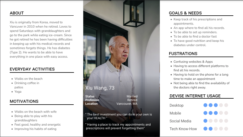
User Personas
As one of the most essential steps in this project, user personas allowed me to get into the mind of two different people with different needs. This focus on the spectrum of the users provides me with the clarity to sketch some flows and design ideas.
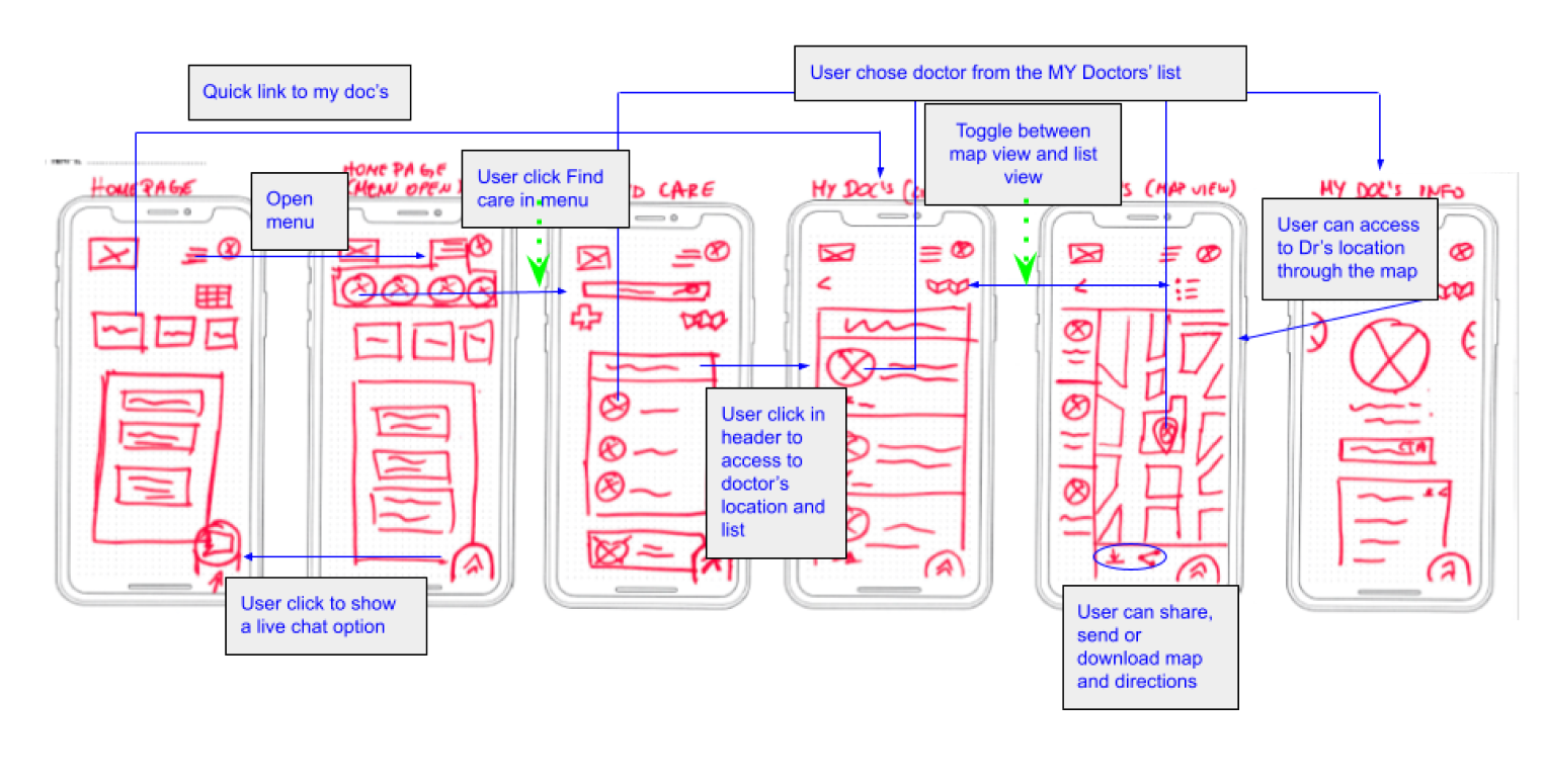
User Flows
With those user personas in mind, I designed their flow through the web app. I wanted to make an easy and fast way for them to complete a task successfully.
.jpg)
.jpg)
Site Map
To start my design, I needed first to see how my users would organize and categorize the main items that my WebApp would have. I provided them with a card sort with categories already created for them and an open category they could add if needed.
.png)
.png)
Wireframes
With my HTML knowledge, I wanted to create something that would be possible to build. Although it was a challenge as I was making a Web app, I needed to ensure that the responsiveness was adequate. I had a lot of fun in this step of the process. I had so many ideas from the user interviews, and watching the flow come to life was a great feeling.
Mobile Design first
From paper sketches to high fidelity
I started with the mobile design first and continued with the desktop design. Scribbling in paper and finally made a high-fidelity version in Figma.
Mobile version
(Find Care)
Desktop version
(Find Care)
.png)
Usability Testing
To ensure all the thoughts I put into the wireframes were correct and aligned with the users. I created a mid-fidelity prototype and had some users test it. Three users tested my mobile version and three on my desktop version. After the testing, some flows needed to be modified. Then I gathered all the comments and insights into a rainbow spreadsheet and categorized them according to Jakob Nielsen’s four-step rating scale.
.png)


The Iteration Begins
Using the data from the usability testing, I redesigned, modified, and added to my low fidelity. Then I started to develop my first mid-fidelity prototype. I tested this mid-fidelity, and these were some insights from the testing. Here, I start looking into color feelings, sizing, and hierarchy.
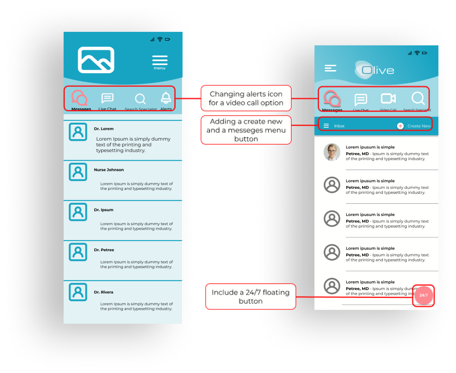
Change #1
Now able to find the Video Call option
Users had a major issue trying to find the video call option. Users suggested having an icon on the communications screen to help them find it.
I also incorporated the floating button with the video call into it, which will help the user find it faster.
Change #2
Confusing colors
When testing, all the users had an issue with the red color for the unavailable dates. Some thought those were days they had already booked. Then others thought those were the only available dates. All users had a feeling of danger or warning. Changing the color scheme and adding a legend will help the users understand more clearly.

.png)
Homepage
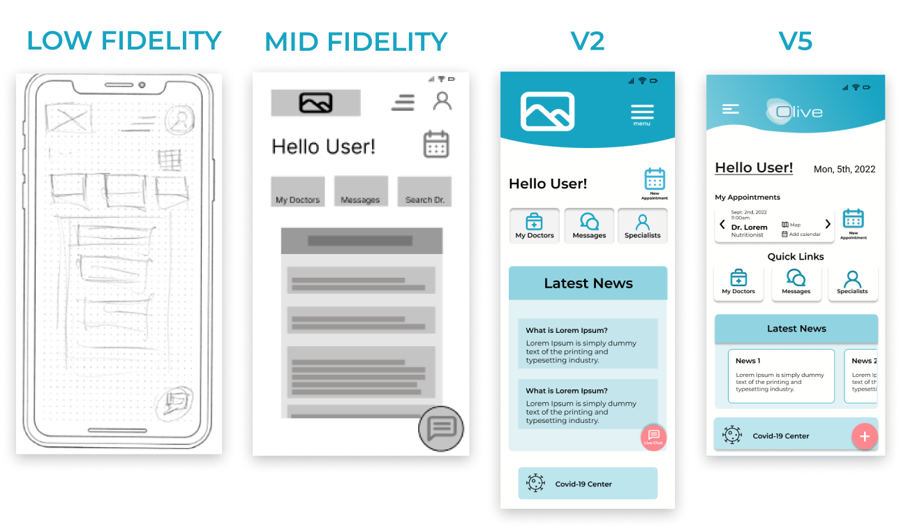
- In the v5 version, I added the current appointment button.
Appointments (calendar)
.png)
- Added them to another screen.
- Modification of the colors in V5.
- Implementation of material design.
Nav Bar Opened

- Made it full screen in V2.
- In V5, instead of dropping down to a full screen, I decided to bring it from the side as it will be in the desktop side menu.
Find Care (List)
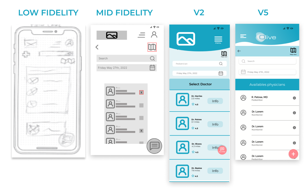
- In V5, I reduced the size of the physicians' pictures.
- Changed the info button to the well-known info icon.
%201%20(1).png)


